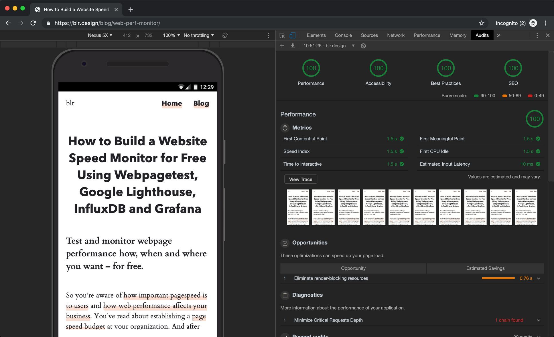
A perfect 100 score in Google Lighthouse
Go ahead and open this page up in Google Chrome’s Developer Tools (⌥⌘i) and start a Google Lighthouse Audit (mobile, simulated fast 3G). You’ll see it gets a perfect 100 on Performance, Accessability, Best Practices and SEO.
Here’s how I did it.
Writing and Handling CSS
Here’s what I did to make sure my CSS was performant.
1. Keep the Amount of Critical CSS to a Minimum
I started styling for mobile breakpoints first and progressively added stylings for larger breakpoints.
That left me with around 400 lines of CSS for mobile and around 90 lines for larger breakpoints.
I even added all my non-mobile stylings to the end of my main stylesheet so I could quickly and easily split up my CSS files and load breakpoint-specific stylings per media query. But it turns out, my CSS was so small, I could just inline it.
2. Avoid or Strip Down Vendor CSS
I usually use Normalize.css to reset browser settings. But instead of including the 8 KB non-minified file no-questions-asked, I only picked out what I really needed:
/* ====================================
Normalization
==================================== */

body {
  margin: 0;
}

article,
figcaption,
figure,
footer,
header,
main,
menu,
nav,
section,
summary {
  display: block;
}
And that’s it.
I wasn’t going to add any video or audio to my blog to start, so I wouldn’t need any of those stylings.
Savings: 61 stylings.
3. Minify and Inline CSS
I ended up with around 9.8 KB of non-minified CSS, which is pretty small.
After following Eleventy’s tutorial on how to minify and inline CSS, that left me with about 5 KB of minified CSS in each of my statically generated HTML pages.
| Original CSS Size | Minified CSS Size |
|---|---|
| ~ 9.8 KB | ~ 5 KB |
Savings: 1 render-blocking request and ~ 5 KB CSS
Working With JS
I only needed JS for custom lazy loading and a little script that displays page load time in the footer. No tracking, no other third-party scripts.
I also wrote vanilla JavaScript, so no jQuery.
That left me with only 3 KB of non-minified JS.
Following Eleventy’s tutorial on how to minify and inline JS, I was left with ~ 2 KB of JavaScript.
Savings: 1 (potentially) render-blocking request
Working With Images
1. Use a Picture Element for Responsive Images
The problem was writing blog posts and pages in Markdown and inserting images. Markdown uses this syntax to insert images…
…which transpiles to…
<p>
  <img src="path/to/file.jpg" alt="Image inserted via Markdown" />
</p>
By using picture elements, I can serve the user next-gen image formats (e.g. WebP) and sizes to minimize the number of unused pixel the client downloads.
<picture>
  <source media="(max-width:370px)" srcset="img/image-370.webp 370w" type="image/webp" />
  <img src="img/image.jpeg" alt="An image in a picture element" />
</picture>
So I used shortcodes in Eleventy to insert picture elements instead of the standard Markdown syntax.
In .eleventy.js I added this.
module.exports = function (eleventyConfig) {
  // Responsive image shortcode
  eleventyConfig.addShortcode("insertImage", function (filename, alttext) {
    return `
<picture>
  <source sizes="auto" media="(max-width:641px)" data-srcset="../../img/${filename}-641.webp 641w" type="image/webp">
  <source sizes="auto" media="(max-width:641px)" data-srcset="../../img/${filename}-641.jpeg 641w" type="image/jpeg">
  <source sizes="auto" media="(max-width:873px)" data-srcset="../../img/${filename}-873.webp 873w" type="image/webp">
  <source sizes="auto" media="(max-width:873px)" data-srcset="../../img/${filename}-873.jpeg 873w" type="image/jpeg">
  <!--

  And more image sizes and formats

  -->
  <img sizes="auto" src="../../img/${filename}-1935.jpeg" data-srcset="../../img/${filename}-1935.jpeg" alt="${alttext}">
</picture>
    `;
  });
};
So I could insert responsive pictures with this shortcode in the Markdown for pages and blog posts.
<!-- Markdown -->
{% insertImage "file.jpg", "Image inserted via Markdown" %}
Savings: Unused kilobytes due to improperly-sized images; futher reductions in image data by offering images in WebP format.
2. Lazy-Load All Images Below the Fold
To handle lazy lazy-loading images, I used a similar shortcode called insertLazyImage.
<!-- Markdown -->
{% insertLazyImage "file.jpg", "Image inserted via Markdown" %}
module.exports = function (eleventyConfig) {
  // Responsive image shortcode for lazy loading
  eleventyConfig.addShortcode("insertLazyImage", function (filename, alttext) {
    return `
// Add "lazy" class to the picture tag
<picture class="lazy">
  <source sizes="auto" media="(max-width:641px)" data-srcset="../../img/${filename}-641.webp 641w" type="image/webp">
  <!--

  And more image sizes and formats

  -->
  <img sizes="auto" src="../../img/${filename}-1935.jpeg" data-srcset="../../img/${filename}-1935.jpeg" alt="${alttext}">
</picture>
    `;
  });
};
And in my JavaScript, I pretty much followed Google’s Web Fundamentals article on lazy loading, combining the IntersectionObserver approach with a fallback.
Then I set the picture sources’ srcset to data-srcset and the picture images’ src to srcset.
Savings: The total of all kilobytes of images below the fold.
3. Compress SVGs
Since I only had a few SVGs, I ran them through SVGOMG, the SVGO UI tool.
Savings: Tens to hundreds of kilobytes per SVG file.
Compression & Caching
I enable compression and caching simply by adding an .htaccess file to my root directory.
# Compression
AddOutputFilterByType DEFLATE text/plain
AddOutputFilterByType DEFLATE text/html
AddOutputFilterByType DEFLATE text/xml
AddOutputFilterByType DEFLATE text/css
AddOutputFilterByType DEFLATE application/xml
AddOutputFilterByType DEFLATE application/xhtml+xml
AddOutputFilterByType DEFLATE application/rss+xml
AddOutputFilterByType DEFLATE application/javascript
AddOutputFilterByType DEFLATE application/x-javascript

## EXPIRES CACHING ##
<IfModule mod_expires.c>
ExpiresActive On
ExpiresByType image/jpg "access plus 1 month"
ExpiresByType image/jpeg "access plus 1 month"
ExpiresByType image/gif "access plus 1 month"
ExpiresByType image/png "access plus 1 month"
ExpiresByType image/webp "access plus 1 month"
ExpiresByType text/html "access plus 1 hour"
ExpiresByType text/css "access plus 1 month"
ExpiresByType text/webmanifest "access plus 1 month"
ExpiresByType application/pdf "access plus 1 month"
ExpiresByType text/x-javascript "access plus 1 month"
ExpiresByType image/x-icon "access plus 1 year"
ExpiresDefault "access plus 2 days"
</IfModule>
## EXPIRES CACHING ##
And that’s it.
Savings: I haven’t really calculated that yet.
What’s Next: More Optimization
So where to go next after getting to 100? Well, there’s always room for improvement. I’d like to look into:
- using Web Font Loader for more control over the way webfonts load
- playing around with prefetching
- further optimizing image sizes
- lazy-loading SVGs
- Using CDNs for assets
- …
But I’ll continue to optimize and weigh potential performance gains against increased complexity.