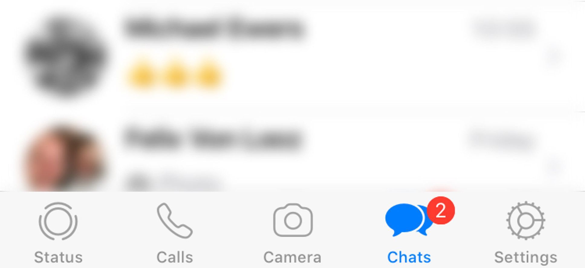
Whenever I use WhatsApp on my iPhone, I have to really think about where to find chats. The Chat icon is there somewhere amidst a Camera icon and Settings icon.
I’d sure love to know how often people pick up their smartphones and think: Gee, lemme open up WhatsApp and then take a picture before I pick who I want to send it to!
And isn’t your status something you set from time to time – something that could hide behind Settings?
With some tweaks, I’m sure users (or at least one user in particular) could more quickly navigate to WhatsApp’s main fuction: chat.
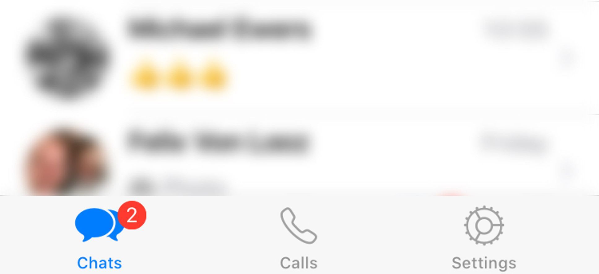
Concept 1: Reduce and Restructure the Standard Tab Bar
If you could set your status in Settings, you could ditch the Status icon.
Apple’s Human Interface Guidelines makes it pretty clear to “use a tab bar strictly for navigation.”
“Use a tab bar strictly for navigation.”
The way I see it, the current camera tab is essentially starting the camera – which is an action. So let’s just leave the camera function within chat itself and reduce the tab bar some more.
Then I’d move the Chat icon to the first spot from left, which corresponds to reading direction (you could place it on the first spot from right for languages where you read from right to left).
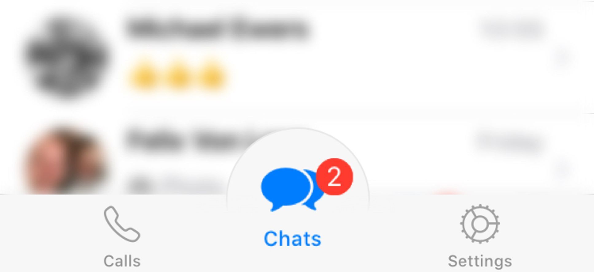
Concept 2: Make the Most Important Thing Bigger
Bigger, irregular objects seem more important than smaller, similar ones. By making the Chat icon bigger and placing it in a bubble in the middle of the tab bar, it definitely sticks out.